Brochure design is one of those marketing skills that looks easy until you actually try it. You sit down with a blank template, and suddenly you're staring at emptiness wondering where your company info goes, what font to use, or whether anyone will even read this thing.

Here's the honest truth: a good brochure design works because it follows a few simple rules. It doesn't try to do too much. It has a clear job. And it looks professional enough that people take you seriously.
Let's break down how to design a brochure that actually converts prospects into leads.
In this article
- Start With Your Brochure Design Purpose
- Choose the Right Brochure Design Format
- Nail the Brochure Design Layout
- Pick Colors and Typography for Brochure Design
- Write Copy That Matches Your Brochure Design
- Images and Visuals in Brochure Design
- Practical Tips for Your Brochure Design Process
- Common Brochure Design Mistakes to Avoid
- When to Bring in Professional Help
- FAQs About Brochure Design
Start With Your Brochure Design Purpose
Before you open any design tool, answer this question: What is this brochure supposed to do?
Are you handing it out at a trade show? Mailing it to past customers? Leaving it on a reception desk? Each scenario changes how you design.
A tri-fold brochure works great for trade shows because it's portable and fits in a pocket. A letter-sized brochure works better for mailings. If you're not clear on the purpose, your brochure design will feel unfocused and your audience won't know what to do next.
Once you know the purpose, define your goal. Do you want people to call you? Visit your website? Schedule a consultation? That one thing becomes your north star for every design choice you make.
Choose the Right Brochure Design Format
Your format is the skeleton. Everything else hangs on it.
The most common brochure design formats are:
- Tri-fold: Folds into three sections. Standard, professional, easy to mail. Works for most industries.
- Bi-fold: Folds in half. Good for simpler messages. Takes up less space but feels less substantial.
- Letter-sized (unfolded): Single page front and back. Minimal but can feel cramped if you're not careful.
- Gate-fold: Opens in the middle like a book. Looks premium but costs more to print.
For most small businesses, tri-fold or letter-sized gets the job done without overcomplicating things.
Nail the Brochure Design Layout
Layout is where most brochure designs fail. People cram too much text, too many images, and too many colors into the same space.
Your brochure design layout should follow this hierarchy:
- Front cover: One headline, one image or visual element. That's it.
- Inside left and center: Your main value proposition and key benefits.
- Inside right: Social proof, testimonials, or next steps.
- Back cover: Your contact info and call-to-action.
Use white space. Real estate that's empty is not wasted. It makes your message easier to scan and gives your eyes somewhere to rest.
Keep your columns aligned. If your text is off-kilter or your images don't match up with your grid, your whole brochure design feels sloppy. A consistent grid makes everything look intentional and professional.
Pick Colors and Typography for Brochure Design
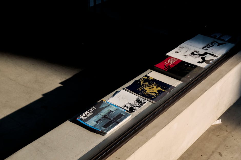
Your colors and fonts are the personality of your brochure design. They should match your brand, not fight against it.
For color, stick to 2-3 primary colors max. If you work with a designer who uses seven colors in your brochure design, they're making your job harder, not easier. Too many colors make people feel overwhelmed and confused.
For fonts, use one for headlines and one for body text. A fancy display font in your headline works. A fancy font for body paragraphs does not. People won't read it, and your brochure design becomes decoration instead of communication.
Make sure there's high contrast between your text and background. Light gray text on a white background? Your audience won't be able to read it. Dark text on dark background? Same problem. Check your contrast ratios on accessibility testing tools to ensure your brochure design works for everyone.
Write Copy That Matches Your Brochure Design
A beautiful brochure design with weak writing is like a sports car with no gas.
Your headlines should answer a question your customer is actually asking. Not "About Us." But "How We Save You 10 Hours a Week on Payroll."
Want results like these?
Keep your sentences short. Paragraphs should be 2-3 sentences, max. People don't read brochures. They scan them. Give your eyes an easy path to follow.
Focus on benefits, not features. Don't tell people what you do. Tell them what changes because of what you do. Instead of "We offer bookkeeping services," try "Your finances are organized, so you can make smarter business decisions."
End every major section with a reason to take action. What's the next step? What should they do right now?
Images and Visuals in Brochure Design
Images make or break your brochure design. The wrong image makes you look amateur. The right image makes people trust you.
Use images that feel authentic to your business. Stock photos of people laughing at salads work sometimes. But honest photos of your actual team, your actual customers, or your actual work almost always work better.
Make sure your images aren't competing with your text. If you have an image and a headline in the same space, one of them needs to be smaller or lighter. Your brochure design should guide the reader's eye in an order: headline first, then image, then body text.
Avoid clip art. It signals to people that you're not serious. Avoid blurry photos. Avoid images that don't relate to what you're selling.
Practical Tips for Your Brochure Design Process

Start by looking at brochures you actually like. What do they do right? How does the text flow? Where does your eye go first?
Don't reinvent the wheel. Use proven templates as your starting point. Customize them, make them yours, but don't start from scratch unless you have design experience.
Print a test copy. How does it look in your hands? Does the text size feel right? Are the folds in the right places? Does your call-to-action stand out?
Get feedback from someone outside your business. They'll catch things you miss because you're too close to it.
If brochure design feels overwhelming or you're not getting the results you want, that's exactly when you should talk to someone who does this professionally. A branding design expert can take your message and turn it into a brochure that actually moves people to action instead of just sitting in a drawer.
Common Brochure Design Mistakes to Avoid
Using too many fonts makes your brochure design feel chaotic. Stick to two max.
Making your brochure design all about you instead of about your customer's problems wastes the space. People care about what's in it for them, not your company history.
Forgetting to include a clear call-to-action means people finish reading and have no idea what to do next. Always tell them.
Not considering your print settings can result in colors that look muddy, text that's too small, or images that pixelate. Talk to your printer about specs before you finalize your brochure design.
Printing too many copies too early. Start small. Test your brochure design in the real world. See what questions it raises, what works, what doesn't. Then print your main run.
When to Bring in Professional Help
You can absolutely design a functional brochure yourself using free or low-cost tools. But there's a difference between functional and effective.
If your business depends on making a strong first impression, or if you're spending money on traffic to fill the pipeline, then investing in professional brochure design makes sense. DigitalPixel works with small business owners on full branding and marketing materials designed to actually convert. Sometimes a professional eye, a few design hours, and a strategic approach to your brochure design pays for itself in a single customer.
FAQs About Brochure Design
What size should my brochure be?
Standard brochure sizes are 8.5" x 11" or 8.5" x 14" (legal). Letter size is the easiest to work with and the cheapest to print. If you're doing a tri-fold, start with 8.5" x 11" and fold it into thirds (each panel is about 3.67" wide). This standard size also fits in a standard envelope for mailing.
Should I design my brochure myself or hire someone?
If you have design experience and time, go for it. If you don't, hire someone. A poorly designed brochure costs you money in wasted prints and missed opportunities. A professionally designed brochure can pay for itself many times over.
What program should I use for brochure design?
Canva is great for beginners. Adobe InDesign is the professional standard if you're serious about design. Microsoft Publisher works in a pinch. The tool matters less than understanding layout, hierarchy, and your message. Pick one and learn it well.
How do I know if my brochure design is working?
Track your results. Include a unique phone number, QR code, or website URL on your brochure design so you can count how many leads come from it. After 100-200 prints, you'll have enough data to know if people are actually responding. If not, test a different version.
Want results like these?